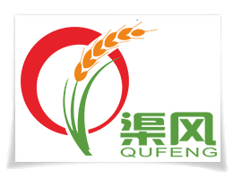

Brand meaning: humans need what kind of food? It is green, safe, healthy, natural food. Satisfying human’s this kind of need is the foothold and starting point of the company, our brand is designed to this concept .
Circle represents a piece of wheat, red represents our career and the human life will be prosperous, progressing day by day in the hopeful wheat field, The ear of wheat represents the raw material come from the nature, the bottom of the ear of wheat represents the products from raw material to finished products is always green, environmental, no added. yellow represents products mature, quality superior, safe and healthy.
brand goal (development policy) : using top superior equipment, technology, management, producing high quality products. protecting human health.
Brand positioning: QuFeng food, noble identity, superior life .